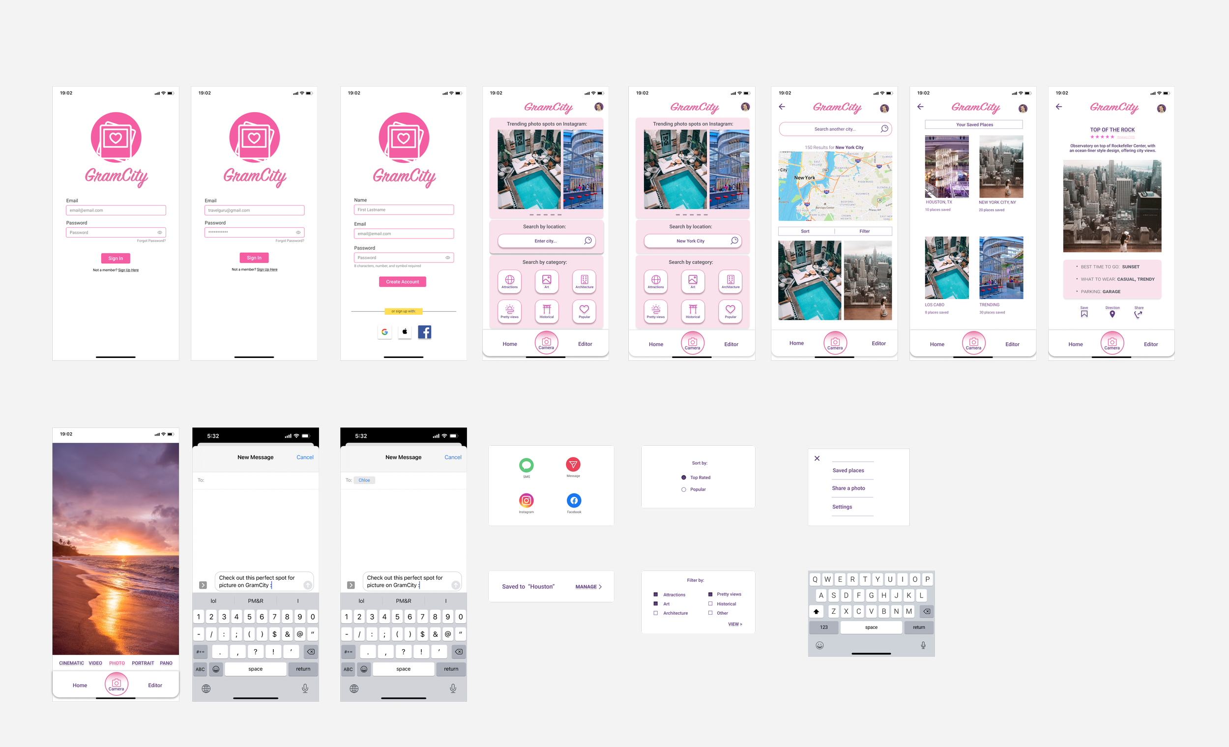
Develop a new search feature for GramCity, a photo-editing app, to help users find instagram-able locations to take photos in different cities.
Role: User Research, Wireframe, Prototype, Usability Test, Visual Design
Collaborator: Ana Massette
PROJECT OVERVIEW
Company Background
GramCity is a photo editing app that allows users to enhance their photos before sharing to social media.
The company noticed that besides editing, users also want to find good locations to take pictures.
Business Goals
Explore and quickly test possible solutions that can help users find awesome spots to take pictures.
Build a community of users of the same interest.
The Solution:
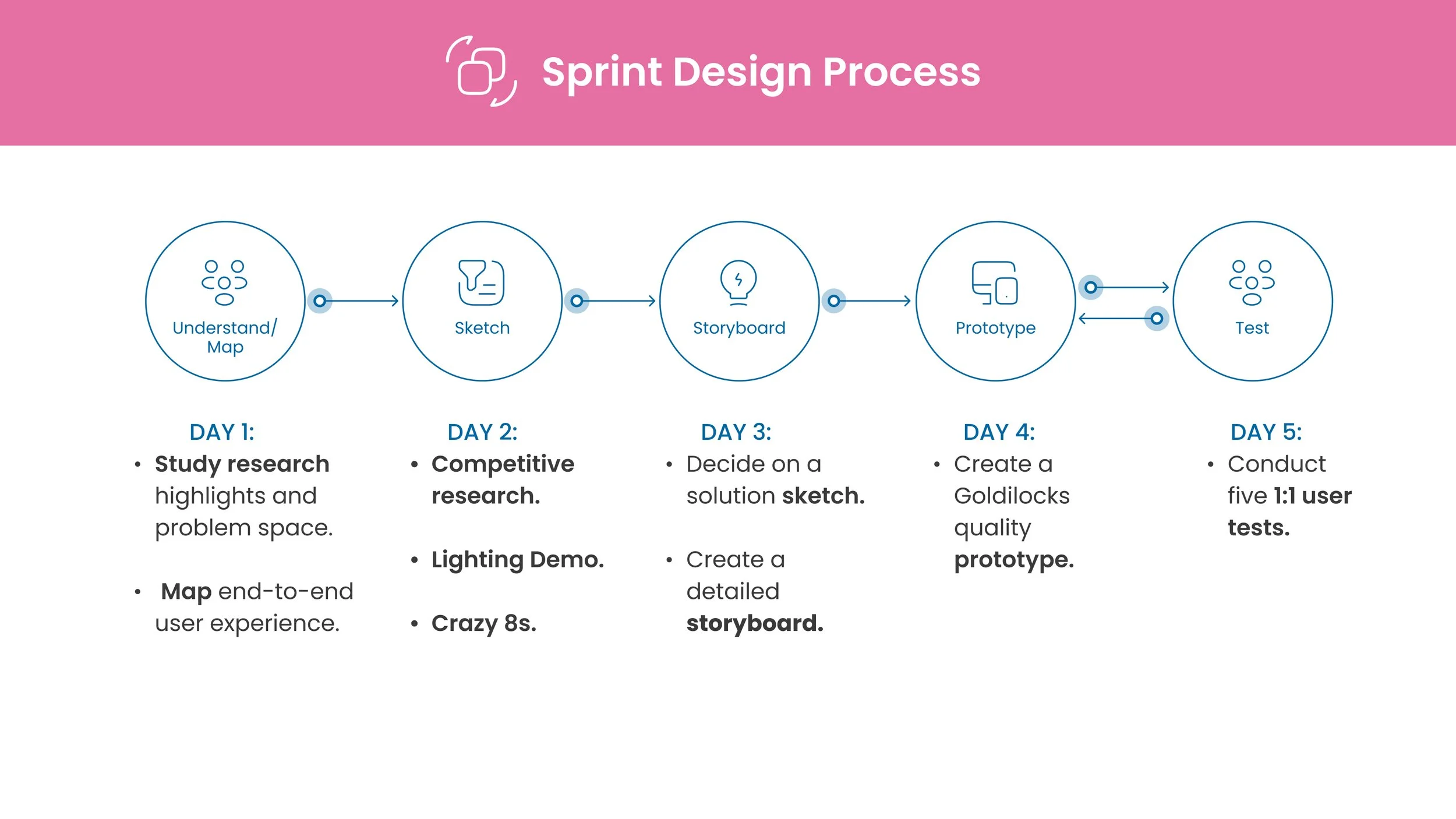
I used Google Ventures Sprint method to quickly design and test a new search feature.
The search feature is designed to help users to quickly find photo-ops locations along with location information, reviews and directions.
The Problem:
Finding and deciding on good photo-ops locations is time-consuming and frustrating for users of GramCity.
Design Process
DAY 1
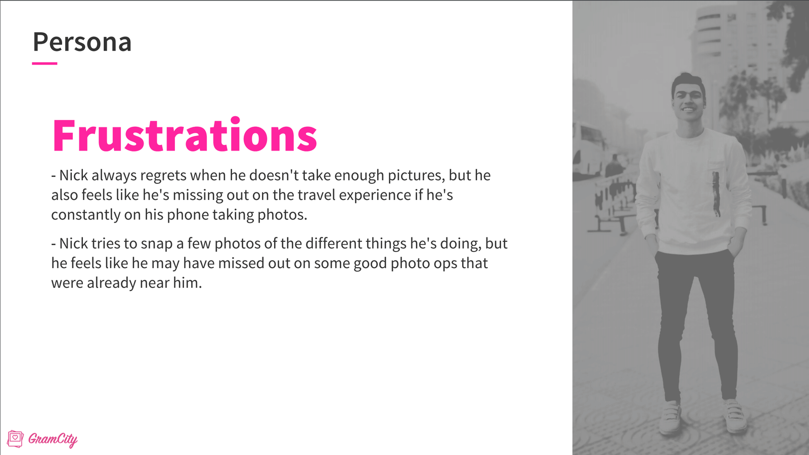
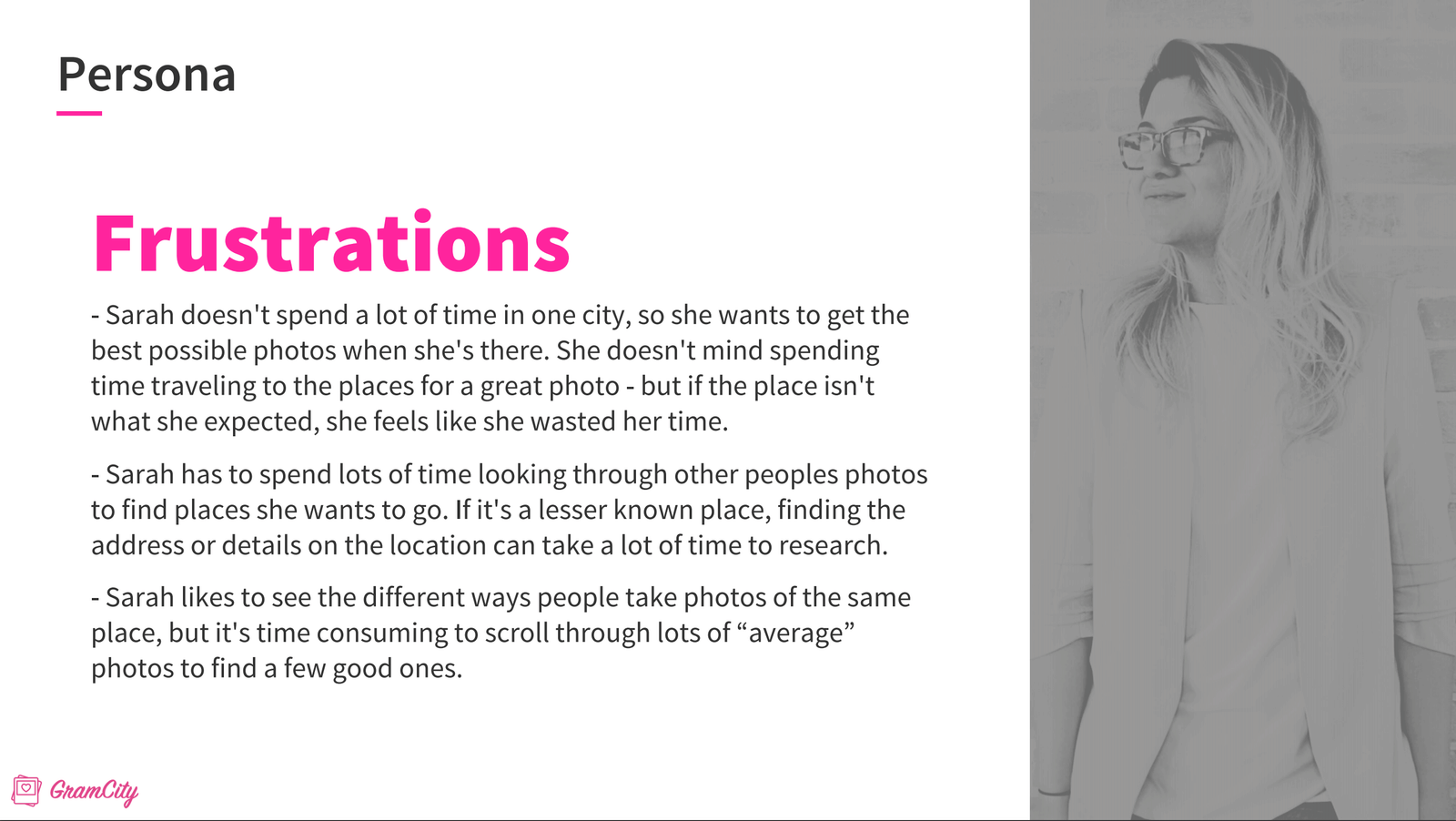
Based on research highlights provided by the company, the Target Users can be represented using two personas,
Nick and Sarah:
Nick
24 years old
Video Editor
Los Angeles, CA
“I want to find great places to take photos to document my trips , but don’t want to spend time researching or traveling out of my way to find them.” - Nick
Sarah
27 years old
Event Production Manager
Chicago, IL
“I want to easily find locations and examples of the best photo ops in a city before planning out my day around visiting them.” - Sarah
How Might We?
Based on data from user research, pain points were uncovered, allowing me to identify the questions to focus on:
How Might We help users to easily explore different photo-ops location?
How Might We help users to quickly decide if the location is good before deciding to go there?
How Might We help users to effectively plan their way to the location?
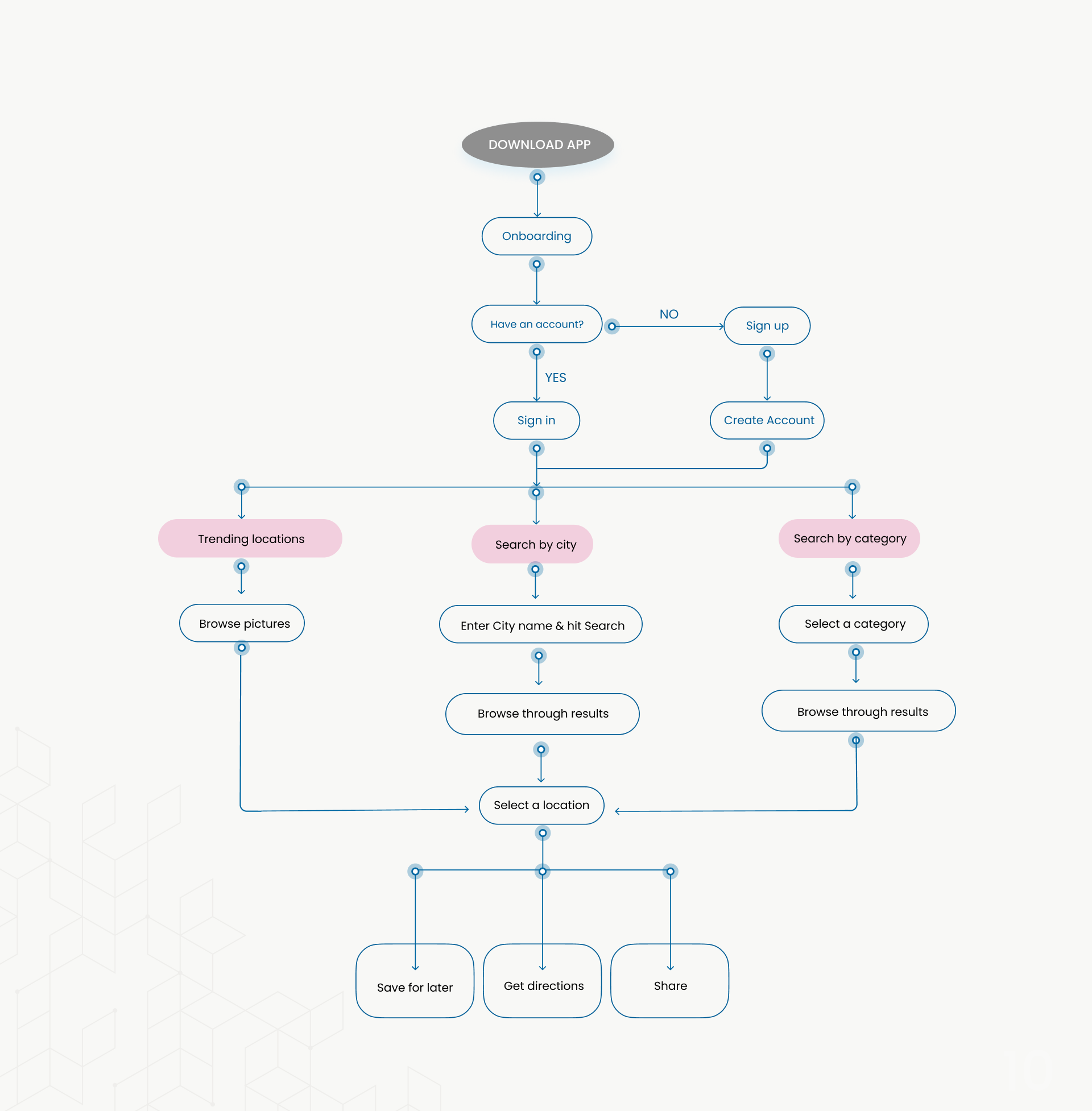
Mapping
I sketched several possible end-to-end user flows for the search feature and selected the one that aims to answer the HMW questions:
DAY 2
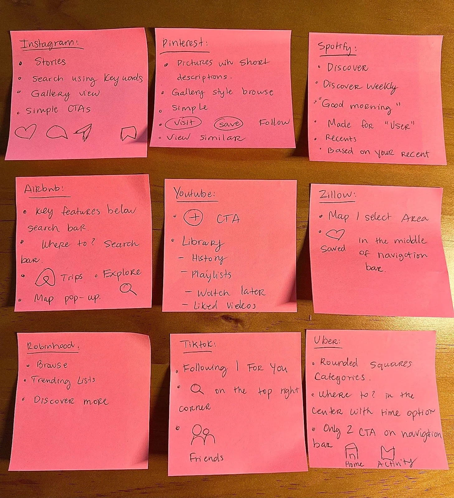
I conducted a Lighting Demos session, starting with 30 minutes of competitive analysis on existing apps on my phone, regardless of the industry. I was looking for design ideas and features that may be helpful to GramCity users’ needs and found great inspiration from Instagram, Pinterest, Spotify, Airbnb, Youtube, Zillow, Robinhood, Tiktok, Uber.
We use these apps on a daily basis, however, we only view them from the perspective of a consumer and not a UX researcher. I spent 2-3 minutes on each app, writing down key ideas and inspirations:
The Big Ideas:
Discover feature as seen on Spotify, allowing users to browse trending photo spots.
Search bar on home screen as seen on Airbnb, allowing users to search based on location.
A simple navigation bar of 2-3 options as seen on Uber, allowing users to quickly navigate main features.
Gallery style search results as seen on Pinterest and Instagram, allowing users to quickly browse through photo spots pictures.
Crazy 8s
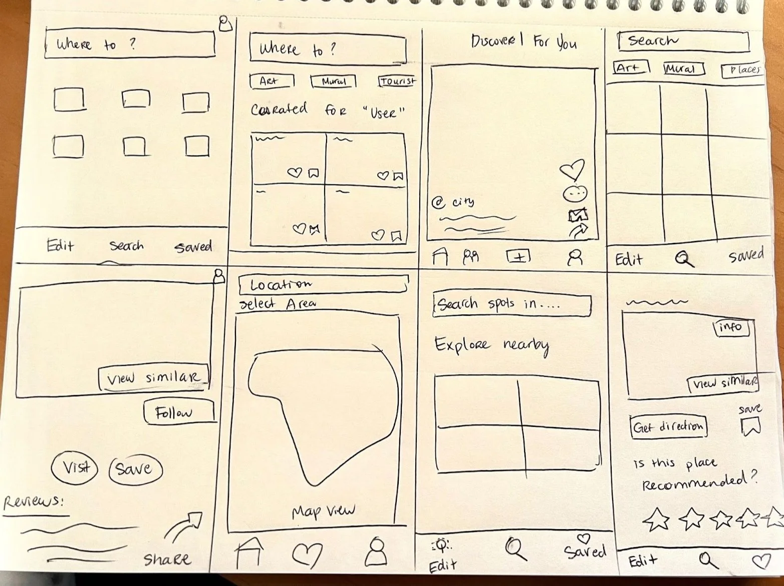
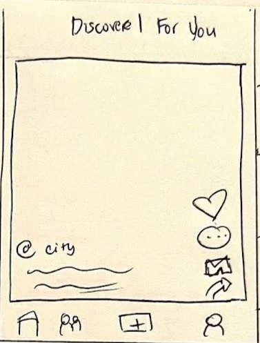
I spent 8 minutes sketching 8 variations of the critical screen ( discover screen) for GramCity.
Selecting the best variation of the critical screen
To make sure I have the fairest judgement of the screens, I took a 15 minutes break.
After getting back, I reviewed the sketches and used the Super Vote technique to narrow down to the best sketch. I can use all three votes on one sketch or one vote for each sketch. I selected 3 sketches. I then used the Speed Critique technique where I spent 3 minute on each of the three sketches & used these questions to help me select the best variation:
Which screen is most effective for solving the problem?
Which screen allows users to discover, plan and share photo-spots?
DAY 3
The Solution Sketch
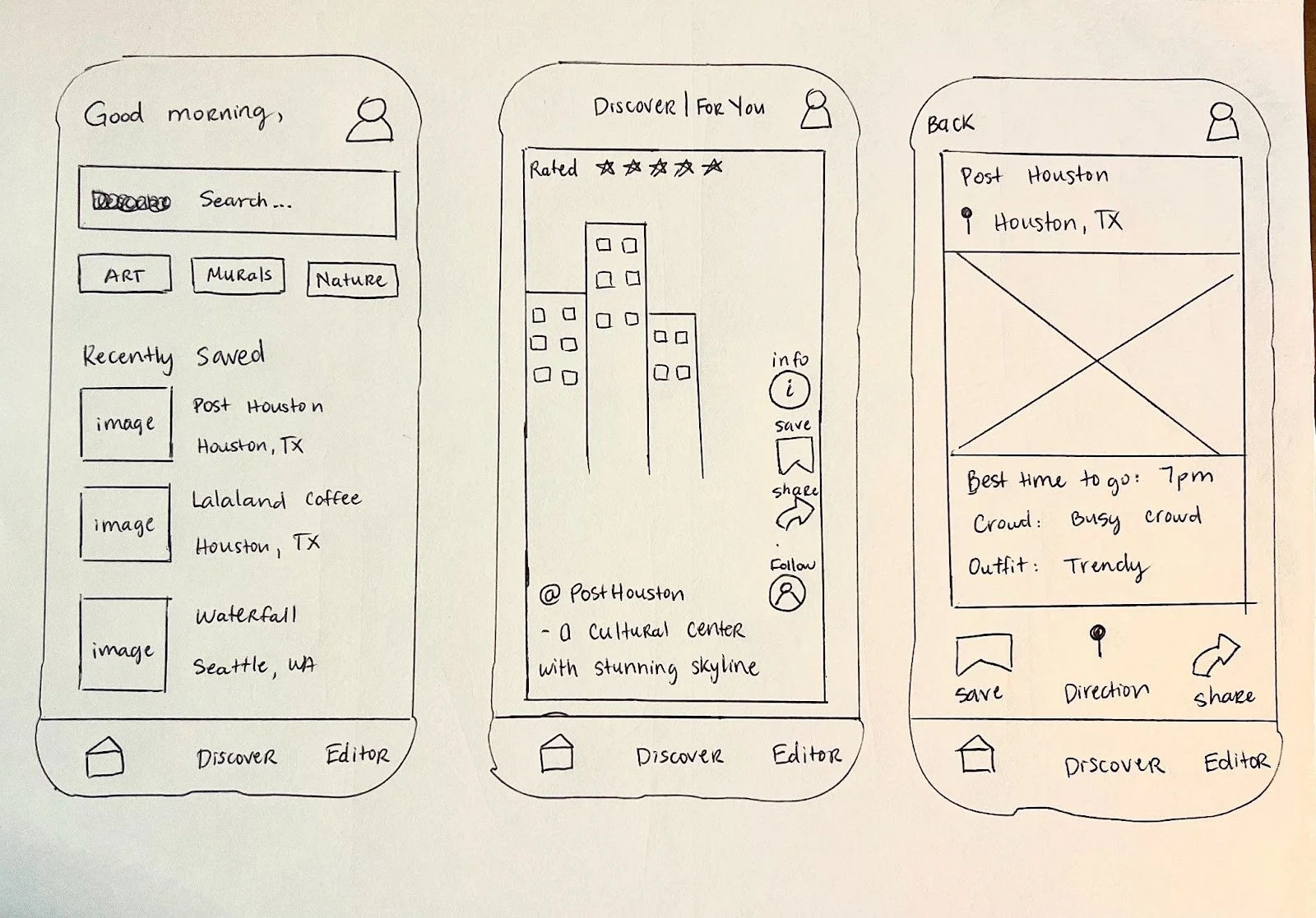
Based on the selected critical screen, I sketched a three-panel board consisting of the screen that comes before the critical screen, the critical screen itself and the screen that comes after it:
The screen that comes before the critical screen is the search screen, the critical screen is the discover screen and following it is the information screen.
Storyboard
To demonstrate how a user might interact with the app, the solution sketch is expanded into a detailed storyboard that tells the story of the user pain points and how they can benefit from our design solution.
DAY 4
Prototype
I quickly created and tested a lo-fi prototype with the following features:
Search and explore categories of photo-ops locations.
View the location’s picture, information and rating.
Save, share and get directions to the locations.
Be part of the app community of users who share photos and ratings of the locations.
Usability Test and Insights:
The lo-fi prototype was tested with five participants and these are the key takeaways:
One participant said the homepage needs more pictures.
One participant said that he was surprised at how much info was shown about the location and found it helpful.
Two participants took awhile to figure out how to get to “Saved”.
All participants said the discovery page is good.
The rating stars stand out and are helpful.
One participant said that the categories should have icons.
Completed Prototype:


